SCORE
CHECK
IRIS HALLMAN
PROJECT OVERVIEW
UNDERSTANDING THE USER
USER RESEARCH
SUMMARY
i conductedboth primary and secondary research for the app.
Primary research included interviews with a variety of users ranging in age and demographic. What I had learned from these interview supported what I had thought: younger generations had very little understanding of what a credit score is or how to use it to their advantage.
While conducting secondary research my point was further proved. a majority of
people didnt know where to look for the information or even what to make of it.
USER RESEARCH
PAIN POINTS:
Information wasn’t accessible
lacked knowledge
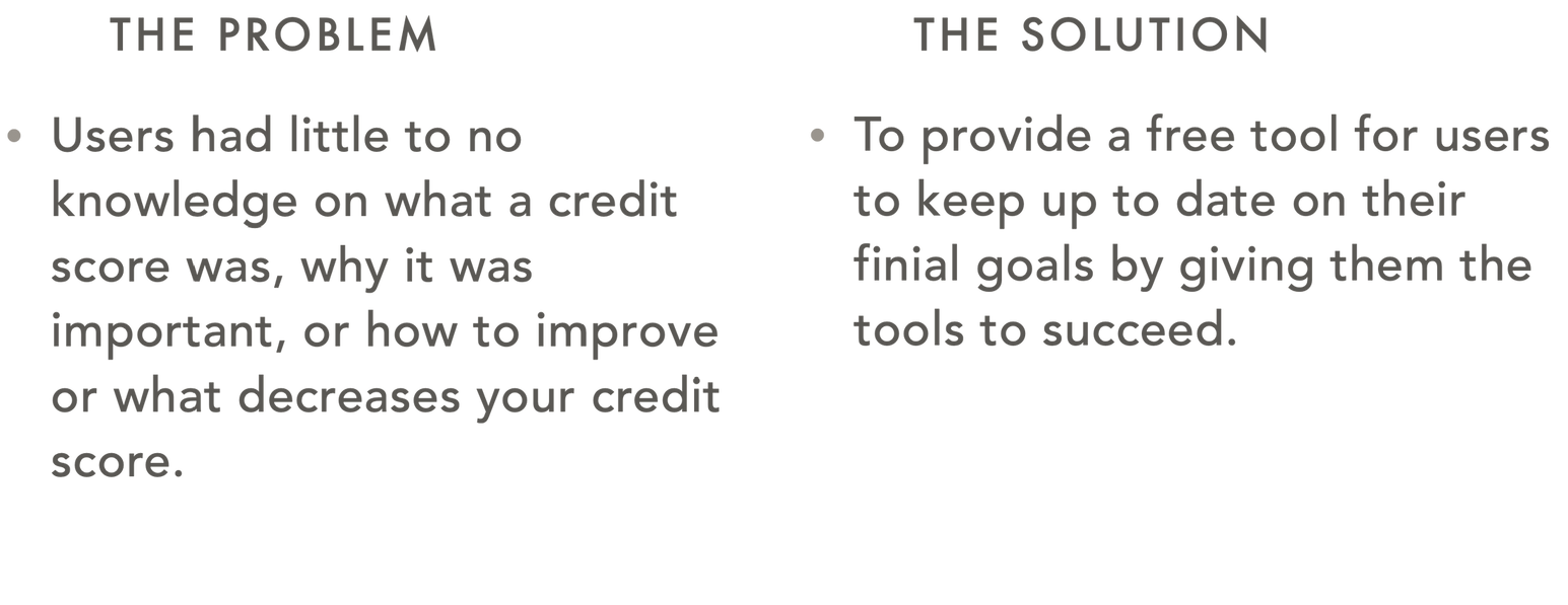
Users were unsure of what a credit score was Or how it impacted their future.
Credit score is not easily accessible. therefore it can be hard more users to manage.
Lacked Education
After find out what their credit score was users still did not knowwhat affected their credit score or how to improve it.
PERSONA:
Anna is a single 23 years old she will be graduating form university in the fall and is excited to start her career as a graphic designer.
Anna’s wants include owning a home, buying her first car and collecting passive income through investments
Her frustrations include student debt, and how challenging it is to get a hold of her credit score and information.

Anna Murry
Graphic Designer

Mike Montminy
Buisness Owner
PERSONAS
Mike is a marred 30 year old who owns a small carpentery buisness. Mike graduated from college 5 years ago.
Mikes needs include: expanding his business, paying off the last of his student debt and wedding loans
Mikes frustrations include:
Figuring out why his credit score decreases even though he's paying it back on time.
USER JOURNEY MAP
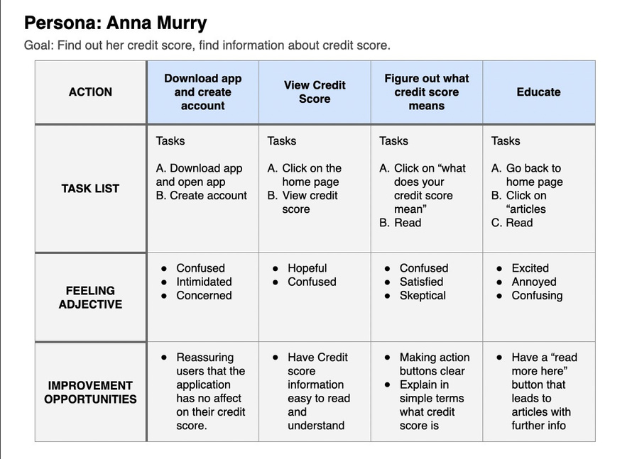
The app allows user to check their score as well as information about their score and the resources to educate themselves on how to improve it.
STARTING THE DESIGN
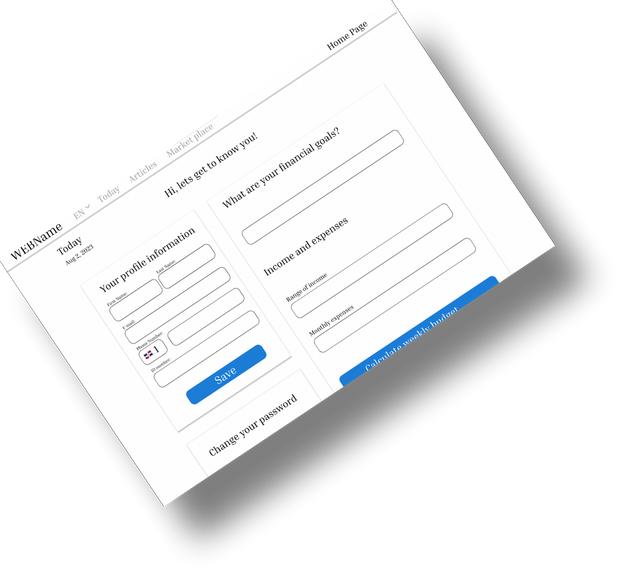
DIGITAL WIREFRAME
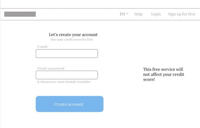
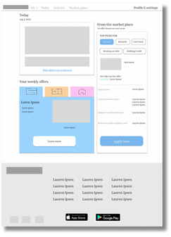
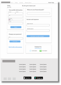
The goal for this design was to be as clear as possible. Information is clearly grouped and sorted based off of priority.

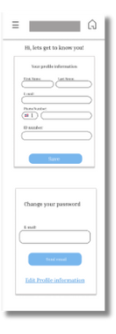
DIGITAL WIREFRAM
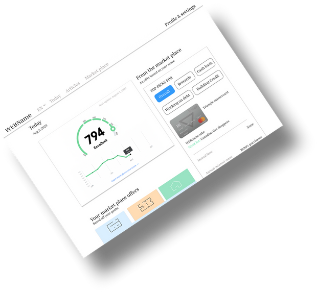
Area for Credit score right on the front page.
expert insight specifically offered for each individual user.
With a quick access link for more information
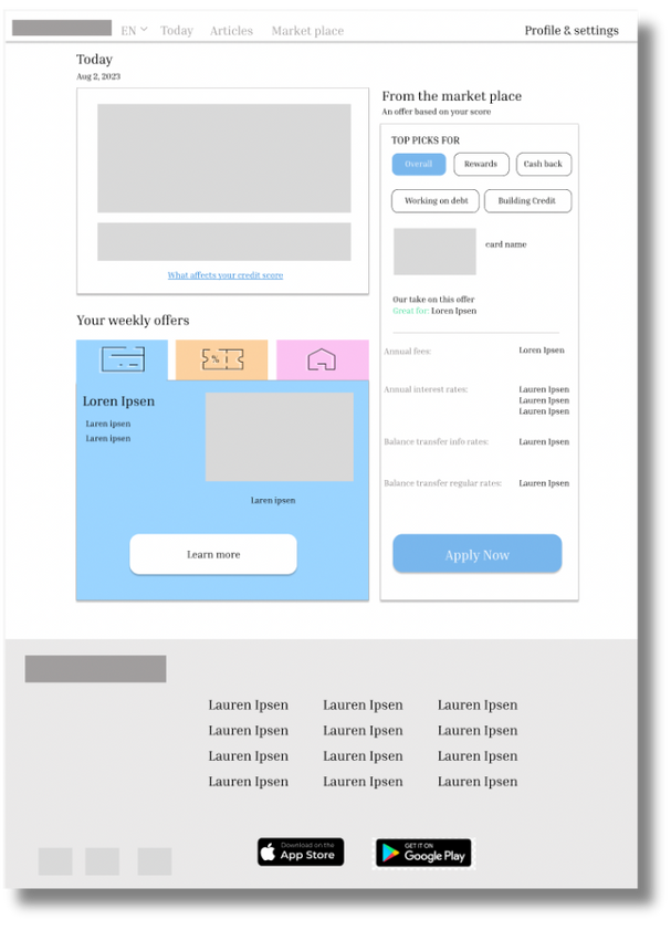
HOMEPAGE
specific recommendations based off of users goals and score.
Try out the prototype here
LOW-FIDELITY PROTOTYPE
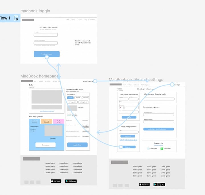
The Low fidelity prototype shows how easy it is to navigate the website regardless of the users needs.
There are clear action buttons and indicators for what ever path the user wishes to take.
ROUND ONE FINDINGS
The colors selected were too light. There was not enough contrast between the color and white background.
More information on the log in page was necessary to
assure users that the website was not going to affect
their credit score
USABILITY STUDY: FINDINGS
I learned alot from the study. I took these findings and created solutions to help make the design more accessable
ROUND TWO FINDINGS
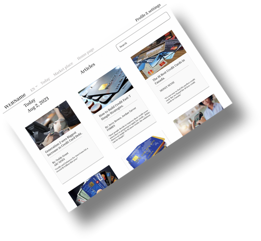
the article page needs a search bar and category columns to better organize information
A more condenced mobile version that isn’t so overwhelming
REFINING THE DESIGN
MOCKUPS
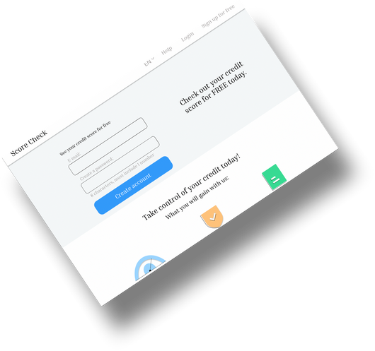
The login page was expanded and more information was added about the website to help reassure users
BEFORE USABILITY STUDY
AFTER USABILITY STUDY

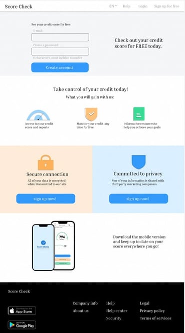
colours were darkened
to make the colour scheme more accessible
A reference bar was also added.
MOCKUP
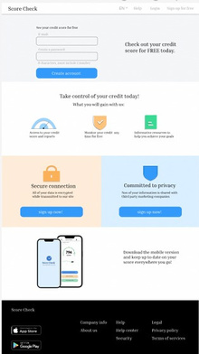
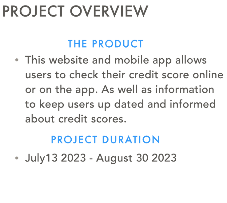
Log in
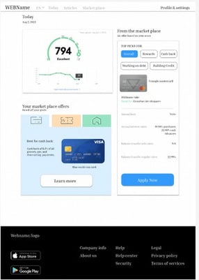
homepage
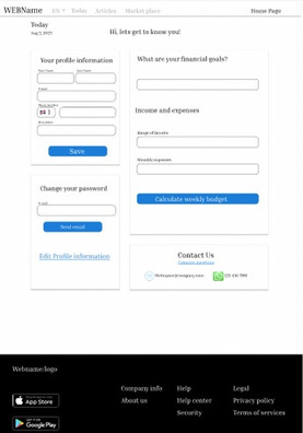
settings
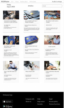
articles
High- Fidelity prototype here
HIGH-FIDELITY PROTYPE
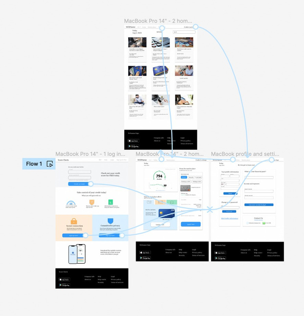
The High-fidelity prototype meets the needs of the users better with being functional and aesthetically pleasing with the seconds usability study conducted on high-fidelity prototype, the design reached its final form and ready to launch.
ACCESSIBILITY CONSIDERATION
01
02
Color palette was check, and changed.
text style and size were considered for accessibility
03
Icons were grouped with text for screen readers
GOING FORWARD
Take aways
Next steps
TAKEAWAY
Lorem ipsum dolor sit amet, consectetur adipiscing elit, sed do eiusmod tempor incididunt ut labore et dolore magna aliqua.
WHAT I LEARNED
Through this process I’ve learned the importantce of interviews and insights. I had a general Idea to get credit scores to people but didn’t realize there was more information necessary with that.
I also learned the importance of color and informational hierarchy.
IMPACT
“I’ve been saving up to get a car and was trying to get a lone but was refused becuase of my low credit score. I didnt realize it was low or how to fix it oreven what it was. And getting the information was so complicated”
“This app is a perfect way for me to keep up to date with my credit score and it makes me feel like I control it instead of it controling me”
NEXT STEPS
01
Create more specific column to group related articles in sections
02
improve design skills and tool knowledge
THANKS FOR YOUR TIME!
ghallman62442@gmail.com